
Clothing Repair and Decor with Iron on Patches Workshops in Banbury
A fun and creative workshop where you’ll learn how to repair and decorate your Jeans, Jackets and more using iron-on patches After hearing quite a


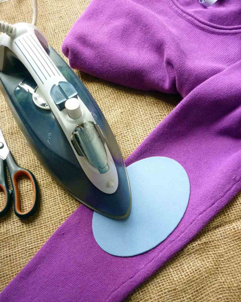
Choosing the best colour for iron on elbow or knee patches to add to a piece of clothing can be as simple or as complicated as you want. A repair can be a very straightforward matter whilst a funky upcycle can elevate a piece from tired to transformational.
Back in the day (my schooldays to be exact), my jumpers were constantly wearing through at the elbows and my mum being a tailor, was able to fix them by sewing on cloth or leather elbow patches in the same colour. Products as convenient as Vintage-Patch iron on elbow patches didn’t exist in those days, so it was a fiddly job, but well worth it for the final result – my school friends always commented on how nice the repairs looked. Regard for the humble patch has stayed with me, although these days with my own brand, I do aspire to stock every permutation of colour and pattern as well as the ubiquitous navy blue!
Plain colour iron on patches are my shop’s best sellers, with lots of greys and blacks sent out for repairs to school uniforms and work wear, but bright shades such as red, orange and sunflower yellow also sell well, which leads me to think that a pop of colour lifts the spirits of many wearers. It’s a fact that colour can have an effect on mood so choosing one that will make you smile is time well spent.
I’ve been planning to restyle a couple of sweaters using patches in new colours recently added to the plain range. Whilst each of them looked good, it took a while to really make my mind up. Sometimes too much choice can be a dilemma, and my ponderings prompted me to write this post.
So, what are the options?

Plain neutral tones such as black, navy blue, sage green and brown are common colours for trousers and jumpers and most repairs make use of the same or a closely matching colour patch.
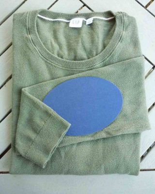
This is when varied shades of the same colour family are used, for example navy and light blue, forest and sage green, brown and beige. It often works well where the patch is a stronger or paler version of the same basic colour. Tone on tone can also be interpreted as similar densities of different colours that share the same primary, for example maroon red and aubergine or mustard yellow with pumpkin orange, or blue and green as seen here.
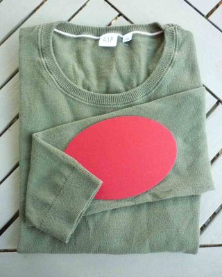
Using a colour wheel to work out a colour’s opposite is a fun exercise and the pairings often look great together as they visually enhance one-another. In their purest form, primary colour opposites on the wheel are very striking – Blue and Orange, Red and Green, Purple and Yellow. Black and white also fall into the opposites category. If that’s a bit much and you want a more subdued version, going for a pastel or darker shade makes excellent alternatives. Think light pink and mint green, lilac and pale yellow, midnight blue with burnt sienna, and burgundy with olive green.
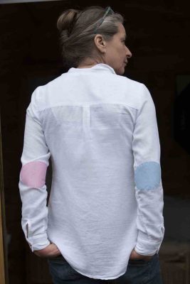
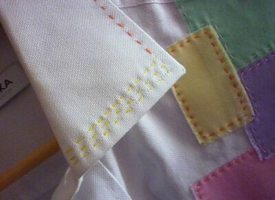
Mismatched effects are popular these days and in truth you could probably choose any colour and run with it so long as you had confidence in the final result. Acid green heart patches on a grey tweed jacket? Why not! I recently patched a shirt with different colours on each elbow and was pleased with the result. I’ll be doing the same again for sure. The rule is, there are no rules, though it did take me fully 20 minutes to decide whether to use pink and blue or pink and mint green. As you see from the photo, the blue won.
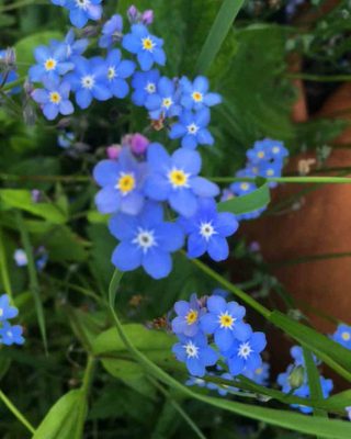

If I’m undecided about colour combinations, I love looking to nature for inspiration. These spring flower photos gave me the idea of adding blue patches to a pale yellow shirt.

Vintage-Patch iron on patches still benefit hugely from additional stitching around the edges which will give them longevity through many washes and wears and a more finished appearance. Additionally, your stitch work can add a new dimension to the colour palette with thread matching the garment, the patch or a third colour. The design below was inspired by the colours in this wild flower.

OK, there are so many fashion tribes these days, you should take the following with a pinch of salt but as a broad generalisation if you lean towards certain colours it may give a clue to your favourite style of dressing.
Beige, cream, eau de nil, sage and brown, navy and black all lend themselves to classic, country, Skandi and preppy styles. Think cashmere and wool jumpers, tweed or heavy linen jackets, check or pinstripe shirts, jeans, chinos and cargo pants plus uniforms and work wear. They are a safe bet if you want a simple and unobtrusive repair rather than a style statement.
These are great for feminine romantic styles or sporty garments both of which often feature a good deal of pale or white colour fabrics. Think angora and fine knits, floaty dresses, linen suits, faded distressed jeans, ditsy floral or broderie anglais blouses, sweatshirts, t shirts, hoodies and leggings.
Rich colours such as such as burgundy, aubergine, turquoise, rust, orange, purple and mustard lend themselves to the boho or hippy look with its tie dye, opulent shades and variety of fabrics from lush velvets and silks to homespun and outlandish patchworks. Think kaftan dresses, psychedelic shirts, multicolour hand knits, velvet trousers and ethnic print harem pants.
These make a statement whether it be part of a chic Mondrian fan’s wardrobe or a playful indie vibe with an eclectic collection of vivid shades. Some sporty styles like the classic nautical look relies on high contrast with its largely red white and blue colour combo. Think ‘notice me’ and you won’t be too far off the mark.
This is quite an important consideration, as you do want to wear your new creation often. How will the garment / patch combo fit into your current wardrobe; will it go with lots of other things, or be restricted to one or two outfits? This is where neutrals that closely match your garment come into their own, as they are more subtle. But don’t let that put you off – often a surprising combination of colours can still be very versatile. A look at the current colours and styles you wear often should help you go for something with maximum options.
We’ve all been there – that wonderful apricot blouse that makes you look washed out, or the purple dress that always seems to wear you. Sometimes a colour may not suit you but can work really well as an accent. This is where patches are a great option as they can spice up a look without being overpowering, so go ahead and choose a colour that you love but wouldn’t normally wear.
Choosing colours that go well with the season you wear your garment most makes sense. Autumnal and jewel tones for autumn and winter wear, with pastels and brights for Spring and Summer is a good rule of thumb.
Some colours might be more commonly used for certain age group, pastels and brights for young children for example, though again, there shouldn’t really be rules on this. If patching for someone else, it’s always best to ask the wearer – you might be surprised at their choice.
Vintage-patch patches come in many colours featured in the plain category on our website, but if you are looking for something specific, we can make you a bespoke order. Another option is to create different shapes and sizes using your own fabric with our ADHESIVE SHEETS. Just email us to discuss how we can help.
Applying light patches such as cream, yellow or white to dark fabrics can be slightly tricky as the base colour may show through a light weight patch. One solution is to treat this as part of the design, and perhaps stitch decoratively over the top with the darker or a third colour thread. This is what I’ve done with the certise jumper with stitched light pink patches pictured above. Alternatively we can provide a bespoke thicker weight patch if requested – just message us to arrange.
Darks and brights on light colours need a little care. Our patches are pre-washed for colour fastness but to be on the safe side, particularly with red shades, it is always best to wash your garment at cool temperature using a colour catcher at least for the first couple of washes so that any colour bleed is minimised.
How about picking an old jumper or shirt in your wardrobe or a charity shop and experimenting with which colour patches you’d choose.
I’m lucky to have my samples to see how a certain colour combo might look, but laying another garment or scarf in your proposed colour alongside the one to upcycle can work equally well to check how the shades look together. Remember, there are no hard and fast rules – these guidelines should add to the fun and rules are meant to be broken, so dive in confident that the result will be your own unique creative expression.
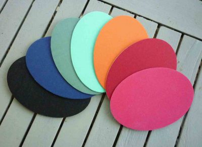
I really hope you’ll decide to go ahead with a project. Some of our new spring shades are pictured below to inspire you, and you can click the link to see the full range of plain colours, shapes and sizes.


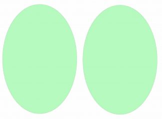

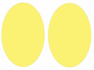

Get a heads up when our next post is published by signing up to our email list for clothing repair tips, upcycled fashion ideas and exclusive promotions.

A fun and creative workshop where you’ll learn how to repair and decorate your Jeans, Jackets and more using iron-on patches After hearing quite a
Quick and effective ways to keep school clothing in tip top condition throughout the academic year You’ve spent a fortune on new uniforms and the
Step by step instructions on how update an old shirt with iron on patches in Spring pastel shades for the perfect Mother’s Day gift. Simple

Step by step instructions on how to make an orange pumpkin face motif from an iron on patch to decorate a top for Halloween.
Choosing the best colour for iron on elbow or knee patches to add to a piece of clothing can be as simple or as complicated

10th – 17th July 2021 (weather permitting) After so many months of putting all planned events on hold due to the pandemic, I’m very excited